
The GrindLab dashboard: your poker KPIs at a glance
You open the tracker after a session. You don't want to dig through ten filters to know if you played well: you want an answer in three seconds. That's exactly what the tracker's dashboard is for.
It's the GrindLab tracker's home page, scoped to your hero identity. A row of tiles sums up your game (BB/100, EV, VPIP/PFR, 3-Bet, showdown, WTSD, W$SD), a bankroll curve plots your winnings over time, and an activity card shows when you play. It's the hub that ties everything together: from there you drop into the Stats page, into session tracking, or into an opponent's profile.
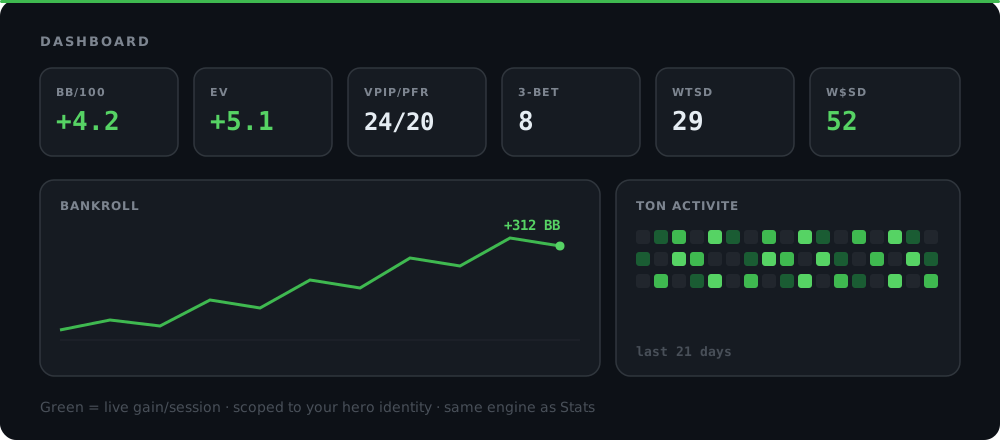
A row of tiles, not a table to parse
The dashboard's whole point is simplicity: each tile is a single number, no click or filter required. You sweep the row with your eyes and you know where to look next.
| Tile | What it measures | Healthy value (rule of thumb) |
|---|---|---|
| BB/100 | Real winrate in big blinds per 100 hands | Positive and stable over time |
| EV | Equity-adjusted winrate (independent of the card that landed) | Close to real BB/100 |
| VPIP/PFR | Voluntary entry frequency / preflop raise frequency | Tight gap (e.g. 24/20) for a consistent aggressive style |
| 3-Bet | Frequency of raising over an opponent's raise | Depends on format, but an extreme number (very low or > 12) is worth explaining |
| Showdown / non-showdown | Split of your winrate between hands reaching showdown and hands won without | Both branches contribute, neither is zero |
| WTSD | Frequency of reaching showdown once you're at the flop | Neither too high (you call too far) nor too low (you fold too much) |
| W$SD | Win rate at showdown | Around or above 50% |
This doesn't replace the deeper pages, it summarises them. The dashboard tells you what to look at; the Stats page and session detail tell you why.
BB/100: the number that matters, but not alone
BB/100 is your winrate in big blinds, normalised to 100 hands so you can compare different sample sizes on the same scale. It's the standard poker benchmark: a player running at +3 BB/100 over a meaningful sample is winning long-term, a player at -2 BB/100 is losing long-term.
The trouble with BB/100 alone is that it bakes in all the variance: a hand won at 90% equity that loses on the river counts the same as a genuine misread. On a small sample, that blurs the signal. For more on reading this number over time, the dedicated BB/100 winrate article breaks down significance thresholds.
EV: taking the card that landed out of the equation
That's where the EV tile (equity-adjusted winrate) comes in. It uses the same calculation engine as the winnings and EV curves: every all-in or decisive hand is recomputed based on the equity at the moment of the decision, not the card that actually landed.
Comparing the two tiles gives an instant diagnosis:
- BB/100 and EV close together: your result reflects your decisions, good or bad. Trust the number.
- EV clearly above real BB/100: you're running below your expected performance, likely short-term bad luck. Keep going, the long run should catch up.
- EV clearly below real BB/100: your luck is masking underlying mistakes. That's the cue to review your lines in the Lab before the variance turns.
Build your poker instincts. Practice equity and pot odds decisions in real time
Try it free →VPIP/PFR and 3-Bet: your style in two and a half numbers
VPIP (Voluntarily Put $ In Pot) measures how often you voluntarily enter a pot preflop, call or raise included. PFR (Pre-Flop Raise) measures how often you raise. The gap between the two says a lot: a VPIP 24 / PFR 20 (a gap of 4) describes a player who raises nearly every hand he plays, a tight and consistent profile. A VPIP 30 / PFR 12 (a gap of 18) describes a player who limps or calls a lot with no initiative, more readable and more exploitable by opponents.
3-Bet adds the aggression dimension against an opponent's raise. A very low 3-Bet signals a player who cedes too much initiative to others; a very high, unbalanced 3-Bet gets exploited right back with wider 4-bets and calls. These three tiles read together, never in isolation: they compose your profile, exactly like the stats row shown under each opponent's seat in the Lab, except this one is yours.
Showdown, non-showdown, WTSD, W$SD: where your money comes from
The last four preflop/postflop tiles answer one precise question: does your profit come from hands won at showdown, or from pots taken without showing your cards?
- Showdown / non-showdown split: the share of your winrate coming from hands that reached showdown versus hands won earlier (an opponent's fold). A healthy profile has both branches active. If all your profit comes from non-showdown, your game leans heavily on fold equity and can collapse against opponents who don't fold. If it all comes from showdown, you might not be winning enough pots without getting there, leaving value on the table.
- WTSD (Went To ShowDown): how often you see a showdown once you reach the flop. Too high, you're calling too far without necessarily the best hand. Too low, you might be giving up winnable pots before the river.
- W$SD (Won $ at ShowDown): your win rate when it does go to showdown. A high WTSD combined with a W$SD under 50% is the classic calling-station combo: you see too many showdowns and lose too many of them. A low WTSD with a very high W$SD can instead mean you only reach showdown with already-winning hands, at the cost of under-value-betting.
These four tiles only make sense together, which is why they sit on the same row.
The bankroll curve, below the tiles
Under the KPI row, a bankroll curve plots your winnings over time. It uses the same charting engine as the winnings and EV curves on the Stats page, with the big-picture view added: it's your bankroll moving up (or not), not a single session.
An uneven but broadly rising slope is the normal poker pattern, even for a net winner: variance carves out dips. What's worth digging into is a prolonged flat stretch or a trend that clearly breaks: in that case, the dashboard gives you the cue, but the period detail or session tracking is where you'll find the cause (a specific opponent, a format, a time slot).
Reading this curve over the long run is also a bankroll management question: a long flat stretch combined with a stack approaching your risk floor doesn't mean the same thing as a comfortable plateau. The bankroll management guide breaks down the thresholds to watch depending on your format.
Your activity: when and how much you play
The Your activity card completes the picture with a dimension winrate numbers don't show: your playing volume over time. It helps you spot sessions running too long (fatigue degrades decision-making well before you notice it), days of compulsive overplay, or on the flip side, activity gaps that make your other stats less meaningful for the recent period.
It's a complementary read, not a performance stat: it gives the context that sometimes explains why a tile moved.
What the dashboard covers, and what stays lighter
The dashboard's KPI tiles are cash-game first: BB/100, EV, VPIP/PFR, 3-Bet and showdown capture the essentials of what defines a cash style. The bankroll curve and activity card, on the other hand, aggregate your full volume, cash and tournament alike.
Tournament-specific metrics (ROI, ABI) and group features currently stay lighter on the dashboard itself: they live, or will live, primarily on their dedicated pages. That choice keeps the home page readable at a glance instead of overloading it with tiles that need varying context.
The dashboard as a starting point, not an endpoint
The dashboard doesn't replace a review. It tells you where to look. A drifting 3-Bet tile sends you to the hand detail in My Hands to see which spots are pulling the number up. A suspicious WTSD sends you to the Lab to replay the hands where you called too far. A plateau on the bankroll curve sends you to session tracking to isolate the period.
Spot the leak in your own stats
The habit to build: open the dashboard before diving into the detail, not after. It saves you the time you'd otherwise spend mentally reconstructing your own stats from how a session felt.
Conclusion
The dashboard sums up your game on one page, scoped to your hero identity: BB/100 and EV for the result, VPIP/PFR and 3-Bet for the style, showdown and WTSD/W$SD for where the profit comes from, plus a bankroll curve and an activity card for context. It's the entry point that ties the tracker's deeper pages together.
Two habits to build:
- Always compare BB/100 and EV before judging a period. The gap between the two tells you whether to trust the result or dig further.
- A tile that stands out is a starting point, not a conclusion. Drop into Stats, Sessions or Players to understand the number, not just observe it.
Open your dashboard, compare your last session to your longer-run curve, and if a tile stands out, go dig into it directly in the Lab or in My Hands.